I’m trying to teach myself better photo composition today. So, this essay is as much me talking to myself as it is me trying to teach you something. Composition is very important – you can’t fix very much of it in post processing beyond cropping. In photography, it involves mostly where you position the camera in taking a picture. Most people, including me, have a tendency to just point the camera at the object of interest and shoot. They get boring pictures because many times there is so much other crap in the frame that the viewer really has no idea of what the photographer was trying to capture. Come to think of it, photographers often have no idea what they are trying to capture either.
Here are a couple of photos of a really simple subject: an old speed limit sign. It doesn’t get much easier than this. I just needed some reasonable light, and the ability to get my subject in the frame, which I got. I have post processed these pretty much the same – tighten up the contrast levels a bit, bump the saturation levels a bit. These are 1/2 original size. Extra mgapixels don’t make these pictures any better. No cropping, as I tried to frame my subject tightly right in camera. I didn’t have all day to think about it either, as I was walking with a guest.
Photo attempt #1:
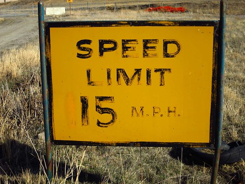
This is pretty much my standard shooting without thinking about it result. It’s not the worst picture in the world. It does have quite a few issues. There are distracting elements behind the top of the sign, the concrete block, the rail road crossing sign, and the piled up bright orange snow fence. I decided the tire was part of the commentary of the old sign.
Photo attempt #2
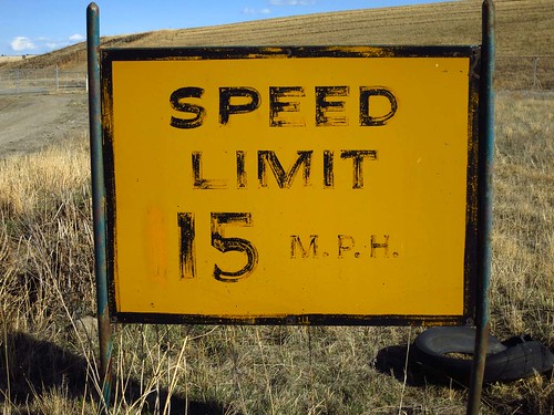
I reviewed the first photo, noting the above issues, and moved my camera down a foot, since we are talking imperial here. That’s right, a foot down and pointing slightly more up is all the difference between these two pictures. This is a better picture. I managed to hide all the original distracting elements behind the sign. I introduced a new distracting element, the warehouse peaking over the hill on the far left. It’s not too bad, as I’m trying to get a bit of the road in there. I also find the horizon distracting, as the hill line coming down to the left distracts from the horizontal line of the top sign border.
I managed to be quite consistent about framing, cutting off the tip of the right sign post both times. I’d have made a third attempt if I’d had more time, as I did notice that at the time. I also might try to get a little more of the road in, if it doesn’t introduce more background buildings. I’d also get the camera down more, to try and get the hill behind it and get the top of the sign in the sky. I would also consider opening up the aperture to blur the background a bit, although I would need a full SLR to do that – I suspect my new Canon S100 was at wide open already. If I’m trying to show the road, putting the sign more to the right might help too, although it would cut off the tire.
I’m not sure if I should have gotten closer and done with a wider angle. This picture is at roughly 50mm in 35mm film terms. If I backed up and went longer, I’d get rid of the other elements, which might be good if I want just the sign. But if I go wider, I can get more of the road in, at the risk of getting other distracting stuff.
So, overall, picture #2 is better, but could use improvement. I’ll try to visit this spot again next week and try this photo again.